I am primarily use writing as a mode of expression, but I would like to use varied forms of expression, like infographics and videos. How many of you have experience in working with different mediums of science communication, and what tools do you use to make videos or infographics?
1 Like
Hi Surat! Yes, its the same case with me, I rely heavily on words to convey science.
At times, I have tried to explain a concept using basic stick figures (using Powerpoint or Paint) or cartoons (free images from Pixabay, Unsplash etc, so there is no copyright issue).
I have seen people use Powtoon for making videos in which some of the basic features are free. Would like to get more suggestions for animating our articles from mentors here 
2 Likes
Hello Surat and Divya,
I have been long been fascinated by communicating science using the visual medium. It can be very inspiring I think, when used with skill! This also has been gaining popularity the world over, and today there are ever so many tools for science illustration. For 2D illustration, medical illustrators have long used vector drawing tools like adobe illustrator for generating publication quality images. This tool can very well be used to generate from journal figures, to infographics. Canva another easy web app if you are new to graphic design (or) wish to upload and collaborate on some of your creatives that you made using other software (like illustrator, indesign, photoshop etc). Innumerable iPad (and android) apps are available for illustration (some good ones are autodesk sketchbook, and sketchbook motion). A great gadget I would recommend to start as an illustrator is a basic wacom tablet (https://store.wacom.co.in/) - a great toy to get your hands wet (digitally). Hope this helps! - LG
3 Likes
Would also like to add, that besides science illustration for outreach and sci comm, there is a rapidly emerging field called bio-cinematics (scientific illustration, 3D animation). Do check the inspirational work of Prof David Goodsell (https://www.youtube.com/watch?v=f0rPXTJzpLE) (from Scripps) and his super fun papers (his most recent one:https://www.sciencedirect.com/science/article/pii/S0022283618305850 ) with watercolor figures. And the brilliant works of Dr. Janet Iwasa (https://www.ted.com/talks/janet_iwasa_how_animations_can_help_scientists_test_a_hypothesis).
Best,
Lakshmi
4 Likes
Dear Lakshmi,
Thanks a lot for sharing with us! Indeed, very fascinating papers. The TED talk by Dr. Janet Iwasa was definitely helpful. Instead of just thinking of illustrations and animations as an add-on, the fact that it could help in exploring and brainstorming more about a hypothesis is motivation enough to learn to use the software in our articles.
2 Likes
Hi Lakshmi,
Thanks for your suggestions and Prof Goodsell’s watercolor images are a delight! Can’t wait to try some of tools you have mentioned.
1 Like
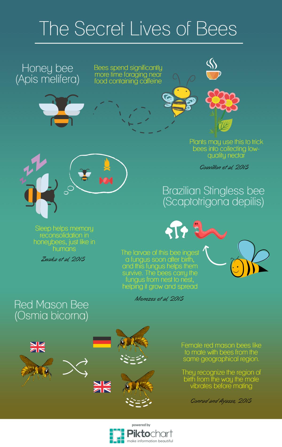
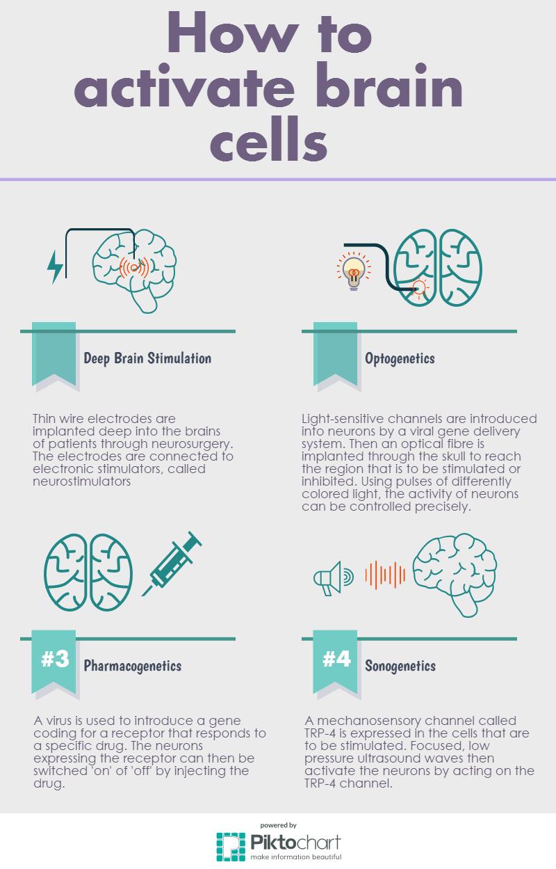
Just wanted to add here - Piktochart is also a nice free tool for creating infographics. Here are a couple I created using this a long time ago -
4 Likes
The infographics look great! Will check out this tool.